
Author: Shandy Tsai
This article is provided by UXeastmeetswest. The original article: 8 UX terms You Might Not Know
About UXeastmeetswest is a content platform created by four alumni of Taiwan’s Tsing Hua University, also UX talents currently working overseas. The team shares with the readers weekly their working and living experience in the United States and in Mainland China. While the four authors all work at a different position at companies of different scales, the content featured on the platform is highly innovating. It not only showcases the working environment of companies ranging from Internet giants to newly-founded IT companies in the United States and in Mainland China, but also shares with readers practical UX skills.
[This article is for readers who want to understand UX-specific vocabulary and also to improve their English proficiency.]
In the US workplace, apart from professional skills, the most important and most challenging part of work is communication. Since English is not our mother-tongue, when the other party speaks too quickly or I just don’t understand the word they are saying, the following embarrassing situation occur rather frequently:
Background:
Me and two other engineers are responsible for developing an App. We are in a discussion on the Interaction Design.
Andrew the engineer was on his phone when he said to me: “When you ‘peach’ this, it will rotate…”
“peach?” I asked, quizzically.
“Ya, ‘peach’, you know” Andrew answered with ease.
I was still frowning, with my eyes wide open and head cocked to the side.
So he started gesturing in the air, and I could finally understand what he means.
This kind of situation is not uncommon in my everyday life. Apart from jargons, I have to also face idioms and phrases. That is why I am writing this article, to introduce you to more UX vocabularies, and to further enhance your English proficiency. At the same time, when you are speaking with a foreigner, using these words will make the other person feel like you are a professional UX talent.

▲ In the workplace, apart from professional skills, the most challenging part of work is communication.
In this article, I will introduce you to eight common UX vocabulary in two parts:
1. Gestures
1.1 Pinch
1.2 Tap
1.3 Flick / Swipe
1.4 Drag and Drop
2. UI Components
2.1 Carousel
2.2 Modal
2.3 Text Field
2.4 Action sheet (Bottom sheet)
1. Gestures
In touch interfaces such as tablets and mobile phones, the interactive design of gestures allows more practical feedback between the user and the device, allowing the user to intuitively control the system, thereby enhancing user experience.
1.1 Pinch
In English, the word ‘pinch’ can have two meanings:
a. to squeeze or compress between the finger and thumb (v.) “she pinched his cheek”
b. to be caught (n.) “I got a pinch of tobacco”
In the interactive design, ‘pinch’ refers to the gesture to zoom in & zoom out. When the two fingers press to move inwards or outwards, such an action is called ‘pinch’.
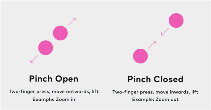
▲ ‘Pinch’ refers to the gesture to zoom in & zoom out, when the two fingers move inwards or outwards together
1.2 Tap
The ‘tap’ we are most familiar with mostly refers to ‘tap water’. In the interactive design, ‘tap’ refers to the gesture of pressing to activate a control, or to select an item. It is one of the most commonly found gesture in UX.
And ‘double tap’ means quickly tapping twice to enlarge an object, or to return an object to it’s original size when it is already enlarged.
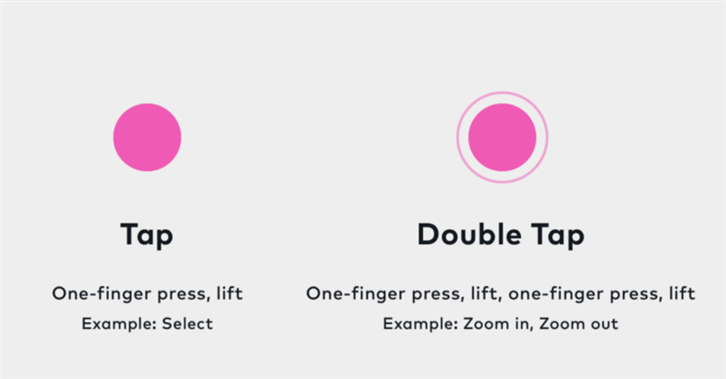
▲ ‘Tap’ is one of the most common gestures in UX
1.3 Flick / Swipe
‘Swipe’ is used to look at a series of photos or pages. We would also use ‘swipe’ to delete items, or to fully display the remaining actions of an item.
‘Flick’ refers to quickly swipe through a series of items. It is most common when the list of an item is too long to be displayed fully on screen.
When we are looking at photos, we would ‘flick’ to see the next photo or the ones followed; we would also ‘swipe’ left to return to the previous page, ‘swipe’ right to go to the next page.
Even though both gestures can be used to change an item, the two gestures are different in terms of speed and direction. For example, ‘swipe’ usually refers to moving your finger horizontally, like drawing a horizontal line with a pencil; ‘flick’, however, is similar to crossing an item off quickly with a horizontal line. It happens much quicker, and can appear in different directions.

▲ ‘Swipe’ to return to the previous page, or to go to the next page. The gesture is commonly used to change pages.
1.4 Drag and drop
‘Drag’ is often linked with dropping and lowering an item to its designated position.
When the user wishes to move an item, he or she would select the item, and drag it to a new position, and finally release it. The series of gestures is called ‘drag and drop’. You may also refer to it as ‘move the item’, but the term ‘drag and drop’ undoubtedly indicates more detailed movements. The gesture is also applicable for normal screens apart from touch screens.
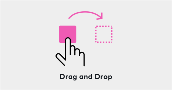
▲ Drag and Drop
2. UI Components
UI design is made up of many different components. In the following paragraphs, I will introduce you to a few UI vocabulary that are both fun and interesting to learn about:
2.1 Carousel
‘Carousel’ is a conveyor belt, or a merry-go-round.
In a UI design, a ‘Carousel’ is used to present multiple items at the same time. For example, when browsing photos, we often see a small dot, picture or arrow to direct users to click on the next photo. And the most prominent one is what we call a ‘Hero image’.
‘Carousels’ have two major advantages. It does not occupy too many layouts, and can force users to direct their attention to a single item at a time. However, there are also criticisms on how such a design does not allow users to browse all the information at once, which may results in them overlooking part of the content at times.
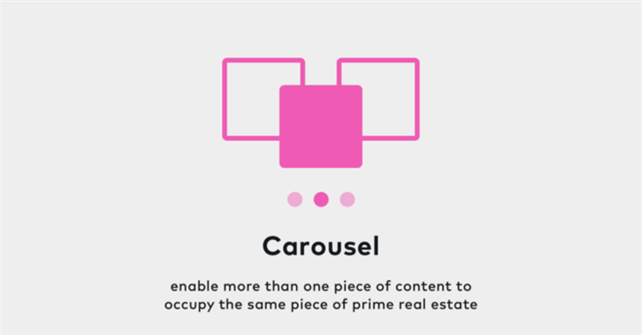
▲ ‘Carousels’ allows users to pay attention to a single photo at a time, without taking up too many spaces in the layouts.
2.2 Modal / Dialog
“Model?” When the manager first mentioned ‘modal’ to me, I confused ‘modal’ with ‘model’ as they sound almost the same, and could not understand a thing the manager was telling me.
‘Modal’ refers to tone of voice. It exists to inform users of important information, or provide guidance for users to decide the next action. The most common ‘modal’ would be warnings and confirmations. For instance, when you are to delete an item, you will find a pop-up window asking you again “Are you sure to delete the item?”; or when you open Google map, the system will ask you to confirm through “Google map would like to use your current location”.
Therefore, ‘modal’ usually appears in a somewhat transparent black screen, separating the main window from the ‘modal’. Such an action would force the user to focus on the pop-up ‘modal’ first, before continuing on his or her original action.
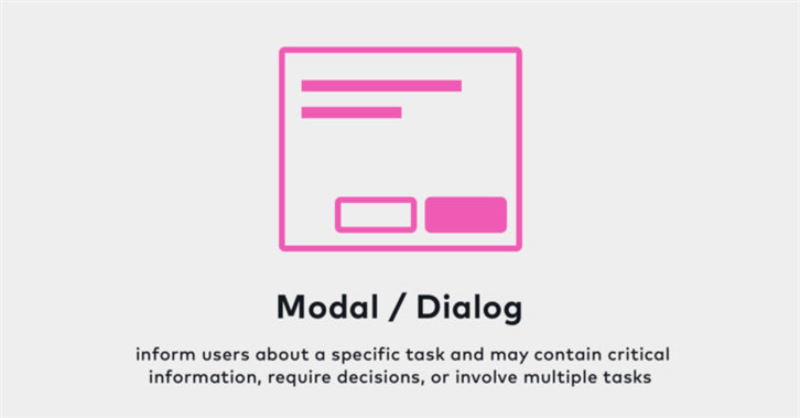
▲ ‘Modal’ exists to notify users of important information, or to provide guidance for users to decide the next action.
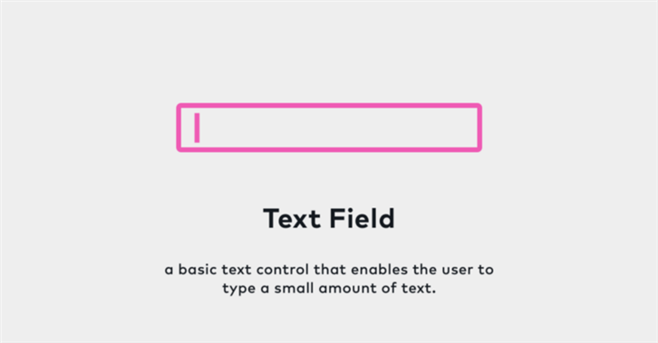
2.3 Text Field
The word ‘field’, usually refers to an area of land, used for growing crops or keeping animals, or a place where you are working or studying in real situations.
The boxes we input words at are called ‘text fields’. You might feel like it is not as complicated as it sounds when I am explaining this to you. But I did not know the phrase ‘text field’ at first, and had to call it a ‘box’ when I first started working with foreign engineers. It was both embarrassing and misleading.
There are a few key features ‘text fields’ should have, for example a clear text label, an appropriate length, a visually focusing design during input, fool-proof error status, and more. If you want to learn more about ‘text fields’, you may also be interest in the article, ‘Designing Perfect Text Field: Clarity, Accessibility and User Effort‘.
▲ A ‘Text Field’ is a box we input our words at.
2.4 Action Sheet / Bottom Sheet
‘Action sheet’ is a specific style of alert featuring a set of action choices related to the current context. For example, when the user tap on the share button, the ‘action sheet’ will display a list of sharing methods including Email, Facebook, Message and more.
Such a display of choices is called an ‘action sheet’ in the iOS system, and a ‘bottom sheet’ in the Android system. Both ‘action sheets’ and ‘bottom sheets’ are mainly used for mobile devices. ‘Action sheets’ are originally designed to be a set of fast and clean display of choices for the user to choose from, which requires no additional screen designs.
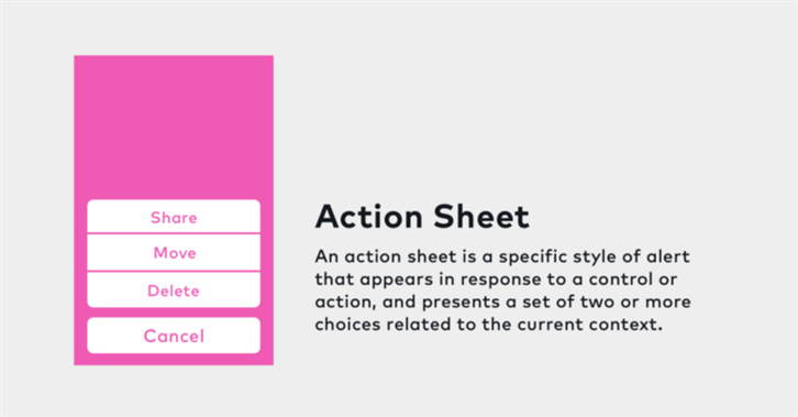
▲ ‘Action sheet’ is a series of action buttons, that can quickly provide users with the different options for the current context.
In the US workplace, communication is a major problem for non-native speakers that are not yet familiar with daily language uses and even jargons. The author therefore introduced us to eight UX-specific vocabularies, which I find very common in the workplace, even though I struggled (not without pain) to recall them when I first started work.
I hope this article provides readers with a fun and direct way to learn about these terminologies (so that your foreign co-workers will be wow-ed by your improvement). If you are interested to read more about UX-specific vocabularies, I am more than willing to provide you with more information regarding this theme of topics. I will see you next week!
References
iOS Human Interface Guidelines — Gesture
https://developer.apple.com/ios/human-interface-guidelines/interaction/gestures/
The iOS Design Guidelines
http://ivomynttinen.com/blog/ios-design-guidelineshttps://designcode.io/iosdesign-guidelines
Material Design
https://material.io/guidelines/material-design/introduction.html#
Touch Screen Gestures http://www.embeddedinteractions.com/touch%20screen%20gestures.html
Swipe vs. flick
https://brianthurston.com/swipe-vs-flick-on-ios-6ff6a516b6aahttps://www.quora.com/Whats-the-difference-between-swipe-and-flick-actions-on-iOS
Designing Perfect Text Field: Clarity, Accessibility and User Effort https://uxplanet.org/designing-perfect-text-field-clarity-accessibility-and-user-effort-d03c1e26004b